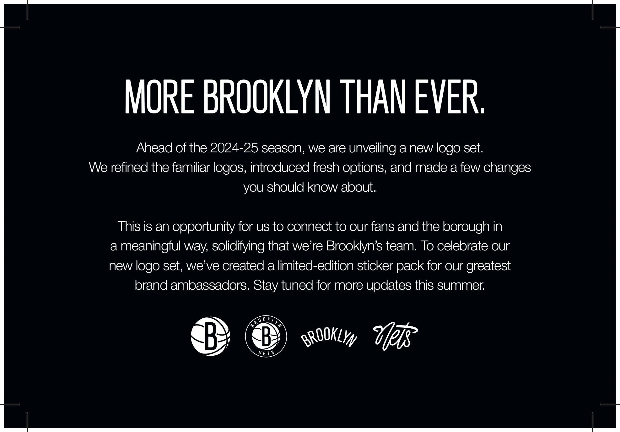
Lead strategy and copywriting for a Nets logo sheet revamp.
Tasked with taking a refreshed logo set to market ahead of the 2024-25 season. Our strategic challenge wasn't creative but fan reception. The Brooklyn Arch was ascending, the Nets Thread was being introduced as a culture-first mark, and the old shield was moving to special application only. For a fanbase where pride of place accounts for 31% of overall affinity, that last part would sting.
Strategy centered on transparent, plain-language communication that met fans and employees where they were. I led the full editorial for the launch microsite, wrote the internal rollout communications that briefed employees on what changed and why, and named every logo in the set — The B-Ball, The Borough B-Ball, The Brooklyn Arch, The Nets Thread — building each with the cohesion of the full system in mind. These names will carry with the organization for years to come.
The outcome was brand infrastructure that set the table for a pivotal era, unlocking new creative flexibility across digital, social, merchandise, and partnerships heading into a rebuild that needed to feel like a new beginning.